Btec Magazine Coursework Final Draft
Btec Magazine Coursework Final Draft
Unit 14 Lifestyle Magazine Creation and Analysis
Wednesday 13th February 2019
Today I started the planning/scheduling for my magazine. I have already concluded that I will be doing a lifestyle magazine due to its use of references to pop culture and the film industry as it includes interviews from Hollywood actors and even the occasional intertextual reference depending on the magazine brand however this was due to the fact that film magazines were not available to pick for our coursework which is a shame as I had been conceiving ideas for film magazines since the beginning of the course due to also taking film as a subject in A level, but this has caused me to adapt and change the concepts I had in my head as I attempt to make it fit into the genre of Lifestyle.
While making these changes to my pre-existing ideas I also thought it would be a good idea to make a plan/schedule in order to not fall behind and hit all the criteria of the course.
The Plan:
Today - Planning and adapting/changing concepts to gear towards lifestyle
Friday 15th February 2019 - Creating my media pack for my magazine to find my target audience by constructing and handing out questionnaires and research double page and front cover spreads for lifestyle magazines to plan layout. *This was carried over into Saturday 16th February 2019
Wednesday 27th of February 2019 - Creating first magazine drafts and testing typography and other design features.
Friday 1st March 2019 - Creating my own cover lines using the same characteristics of magazine structure (Enigma Codes, etc.)
Wednesday 6th March 2019 - Examined school photography studio to see what I would be working with if I decided to take my front cover image using the studio and see available times in the next week or so to plan a date.
Friday 8th March 2019 - Writing the articles and starting construction of magazine front cover.
Wednesday 13th March 2019 - Continuing with magazine construction and using online photos that match what I want in order to see final design preview and switch photo ideas around if necessary.
Friday 15th March 2019 - Have front cover correctly structured ready for my personal photography to be imprinted and take photoshoots later that day.
Wednesday 20th March 2019 - Go through images from the photoshoot and pick which one for the front cover and create my double page spread using place holder photography as I did for the front cover.
Friday 22nd March 2019- Photo Shoot for Double page spread.
Wednesday 27th March 2019 - Finish up the magazine front cover and double page spread for feedback.
Friday 29th March 2019 - Evaluate ethical considerations of the magazine and any other final touches in the criteria I have missed or that needs improving.
Friday 15th February 2019
 Another Man - Male lifestyle magazine focused on fashion and culture for men in there 20's
Lifestyle Magazine Front Covers
Another Man - Male lifestyle magazine focused on fashion and culture for men in there 20's
The main image is bold and draws attention from the audience with the use of focused lighting and well-lit facial features.
Masthead and cover lines in different colours to the background setting making it clear to read.
Use of bright setting of the outdoors conveys the magazine's summer release.
Shares the lifestyle genre conventions with its focus on the costume (clothing/fashion) and travelling.
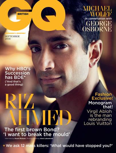 GQ - Male Lifestyle focusing on men in there early 20's and includes typical masculine features/archetypes
Size and bold font of the cover lines and masthead.
Neat sophisticated typography which stands out.
Model is wearing a formal outfit (costume) conveying there wealth and success.
The model/main image Riz Ahmed is a famous actor in a multitude of movies having him on the cover attracts the fan base of those movies and himself.
The magazine provokes stereotypical male archetypes as it references male role models like "James Bond".
The masthead states that this is of the lifestyle genre so people interested in/fans of the genre will instantly see what genre of the magazine and pick it up knowing they want it.
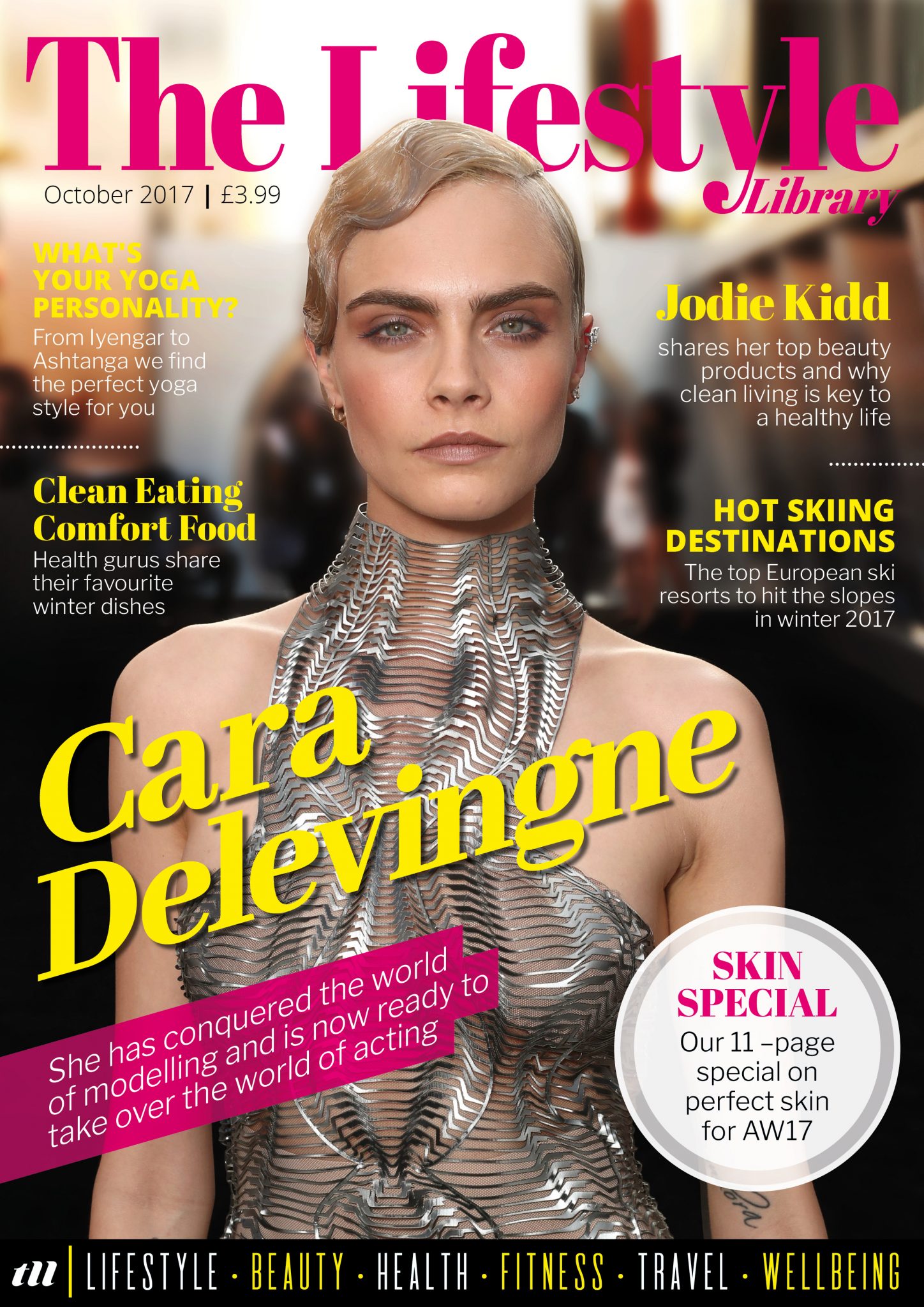
Pink masthead along with the female model/main image conveys a clear feminine/female target due to pre-existing conceptions. Along with the main image of the model being a female in a dress and makeup asserts that this magazine is geared towards females.
Clearly see that there is an article on Cara Delevinge due to her presence on the cover and the quick summary of her taking over "the world of acting"
Coverlines use clear enigma codes by using quick statements
Lifestyle Magazines Double Page Spread

GQ

This is a formal audience type of magazine because lacks images and other engagement techniques like colour and typography structure by being in a simple block text format.
The medium shot of Charlie Hunnam looking directly into the camera with the audience as they read the interview creates a bond between the reader and him as they read his story making them want to continue they are able to see his emotion.
Billboard
The magazine clearly is targeting younger audiences due to the use of clour and the models silly, childish pose along with the use of "kids" in the main article quote/cover line.
This also creates an engaging article due to the use of images which also imply its less formal attitude towards its audience with its highlighted text creates quick reading and getting key facts easy.
 Teen Vogue
This double page spread is clearly for entertainment purposes for people to learn more about Ariana Grande as an informative piece on her latest work and her own personal style.
The audience also must be fans of her work to be interested so they must be young adults/teens due it being teen vogue which focuses on that age demographic.
She is featured in this magazine as she is a role model for younger women which is the target audience as a female lifestyle/fashion magazine.
Saturday 16th February 2019
Establishing my Audience
Lifestyle magazine
Targeting early 20's to 20+ males much like magazines like GQ and Men health
Middle class/C1 and C2 on the social economic scale
Purpose to entertain audiences by informing them of things like fashion and celebrities
Magazine Brand Name - Day to Day
The current issue will be for Halloween and released in October so it will contain the month's relevant topics. "Halloween Edition"
Model/celeb to focus on in the magazine John Doe a director/actor if not in the double-page spread then for the front cover model
In order to consider what to put in my front cover and double page spread, I have given a questionnaire to my classmates and my friends and family to fill before my next lesson, all males due to them being my target audience as the magazine focuses on men's lifestyle.
Questionnaire (Updated with latest results)
Sample Size of 20 people
1. What should the main article of a Lifestyle Magazine be about?
- An informative/instructional article such as workout routines and fashion tips (3)
- An interview with a celebrity (8)
- A journalistic article, states the opinion of someone on trends in fashion etcetera using statements of experts on the topic (5)
- Review of a product/showcase of the product by models (4)
*This has made me decide to have my article be an interview with my front cover model John Doe
2. Colour scheme for a Halloween themed Lifestyle Magazine?
- Orange (1)
- Red (7)
- Black (7)
- Green (5)
*This has made me decide to use black and red as the main colour scheme for my magazine
3. What intertextual reference best suits my Halloween edition of a lifestyle magazine?


- Fright Night (1985) - (7)
- House Of The Dead (2003) - (8)
- The Blair Witch Project (1999) - (5)
*I am glad of this result as it allows me to use the red and black theme colours easier due to them being within the poster but I have to be careful not to make my front cover to similar to the poster as it could put off some none horror fans to my magazine and confuse them with the contents of my magazine.
4. Would you rather see more detailed content in my article or have adverts?
- Adverts (6)
- Detail (14)
*Will fill the page with my article in as much detail as possible
5. Price of Middle-Class Magazine?
- £2.99 (4)
- £3.99 (3)
- £4.99 (6)
- £5+ (8)
*Set price on the front cover as £5.99 putting it in the price range of a magazine like GQ
I originally planned to have 10 questions however I had already sorted out elements like the name and target audience before the creation of the questionnaire so I decided to focus on structural elements of the magazine instead.
Wednesday 27th February 2019
Drafts/Plan Of Magazine
Front Cover Drafts
These are my front cover draft layouts they contain all the structure of a magazine front cover, as you can see from the labelling within the draft such as the masthead and cover lines.
I like both of these structures as they both focus on the front cover model as the main attraction from different camera angles, one using a close up while the other is using more of a medium/long range shot. However, the one on the left feels too cluttered with the cover lines covering the model so I would have to decide to go with the 1st draft that gives the model breathing room on the cover and due to being a close up creates an aura of comfortability/connection with the audience.
Double Page Spread Drafts


Due to my article from my questionnaire, it would appear my audience would desire a less formal text box format and considering that my article will be an interview with the typography and the structure of the article should be more personal and feel like a conversation so with that I have decided on the last draft for my article. This is because it takes up the space for both pages easily provides visual stimulus to the reader to allow for easy readu=ing and understanding of the article.
Testing Masthead Fonts
 Bodoni 72 small caps
This font is very smart and sophisticated however I feel this fits in more with a newspaper rather than a magazine or at least a journalistic information filled media text.
 Book Antiqua

Again this font feels very formal however I think it is to bland in order to catch readers eyes as it has no special quality to the letters.
 Britannic Bold

This font also fails to disguise its self from other pieces of text with its very basic structure however its boldness does, in my opinion, make it more orientated towards younger readers.
 Delimax

This font stands out with its easy youthful texture with its wavey free-flowing body I feel this is the most geared towards younger audience due to its added bonus and a perfect fit for my magazine.
*I found these fonts on the default options available on photoshop as well as on Dafont.com
Testing Colours


Due to red being the most voted for colour on the questionnaire I will most likely be using red within my magazine however after experimenting with these colour tones and their appearance I feel comfortable with saying that my magazine will just have a black background due to the contrast with the colours creating a good looking visual which mimics neon colours. Creating a youthful feel to the magazine which suits my younger 20+ audience along with my font. This also suits my magazine's addition as a Halloween special as it creates an era of mystery/spookiness with the darkness and allows me to easily implement my House of the living dead intertextual reference.
Friday 1st March 2019
Draft Cover Lines
- Who is John Doe and why does he look so good in a suit!?
- How to look like a movie star in 5 easy steps!
- Look as smashing as this mysterious John Doe with Taylor's custom suits.
- Ready for Halloween? Make this Halloween special with these spooky snakes.
- Stay looking good this season with latest fashion trends.
- John Doe isn't the first anonymous celebrity here is the list of famous unknowns.
- Stay in shape with this one workout routine and never look back.
Constructing My Front Cover

Experimenting with photoshop I have created the first version of my magazine which includes a masthead main cover line and price on the date.
Halloween special seems faint and hard to see compared to the other text and the way the date and price are written vertically rather than horizontally.
But other than that I like the way the text compares to the background and how it is eye-catching.

Due to the difficulty of being able to see the "Halloween special" text and the price and date I have changed the font to be more visible and have turned the date and price and moved them to the bottom where they can be seen without distracting from the cover lines.
However, after these changes, it is clear I will need to add in my model in order to get a better idea for how my cover will look and will have to change the font size of the cover lines so they are more prominent.

I have added in an image from the internet that uses the lighting techniques I want to use in my piece.
By having the light strikes my subject the side of the face rather than behind or in front it emphasises the shadows and buts the details of there face into focus as well as allowing me to replicate the intertextual reference that links my magazine to Halloween.
I now realize how I need to bring my subject into to focus and instead of this image I need a male model for my celebrity John Doe due to the male demographic of the magazine, also need to change the font size and style to make them catch the attention of the audience.
Wednesday 5th March 2019
Today I have looked and examined the equipment in the photography studio they had warm lights and a dark background that would be perfect for taking my style of pictures as I need a dark space in order to create the desired effect of shadow on my model's features.
I also continued to structure my magazine using practise images.

I have added in cover lines as well as altered my original typography by changing my main cover line to something simpler and more eye-catching, "Who is he?" by making it contrast with the background by colouring it white and the facts its a question creates this enigma code as the audience feels obliged to read the magazine to find out who this man is.
"John Doe" written in this fancy rich font makes the model seem important and as a celebrity establishes his status.
However, the image itself is not mine but a test image from the internet and I need to get my own original photography. Also, the image seems cluttered by the cover lines.
Friday 7th March 2019
First Photoshoot For Front Cover
Before the shoot I had my model sign a consent form in order to prove that they consented to the use of there image in this magazine.

Before the shoot I had my model sign a consent form in order to prove that they consented to the use of there image in this magazine.


I took a variety of photos in order to pick which ones I thought suited my magazine best.
Unfortunately due to the lack of Gels I couldn't change the lighting t obe red to fit in with my previous practise images so I would have to change the colour in post I would also need to alter the background of these images as its suppose to be pitch black but it maned to catch the light and cast shadow.
However, I feel my images are great as you can see from the examples above they are very intimate with the audience due to to the close-up camera angles and the eye contact into the reader a common toupe used by magazines to make the reader feel a connection between them and the person they're reading about, due to my magazine also containing an interview it is key for my audience to want to get to know my model as the main article is about them talking about there life and their experiences.
I also had my model wear clothing that seems more stylish/fashionable by having them wear a suit, this is because in lifestyle magazines the models are usually decorated in rich and stylish clothing to portray their high status to the reader.
I even had my model wear a tie and have flower added just like the image I used as practice because I loved the way it looked on the cover.
Wednesday 13th March 2019
Double Page Spread Creation

While debating on which photo to use for my front cover I started to create my double page spread using the same technique of having a place holder image of the lighting techniques I want to use for the original photography.
I have added the cover line from the front cover in order to let the audience know they are on the correct page for the article, I have also added the page numbers at the bottom as a little detail. The image is perfectly in the middle of the pages allowing for a symmetrical design to the article and just like in my original brand allowing my article to surround the image of the model creating for an easy read as the reader's mind is engaged by the visual stimuli.
I used a draft line in order to tell the separation of the pages allowing me to how to evenly space my image and article around the pages evenly.
Article/Interview First Draft
Intro
Born in 10th May 1990 John Doe feel in love with the cinematic horror thrillers and Sci-fi.
And so naturally he became infatuated with the industry despite growing up in the
west midlands.
How did you get started?
I and my friend were both studying film at King Edwards Sixth Form College in England
we both came up with this idea to make a film about the PTSD suffers from social media companies
in charge of safeguarding posts/images at the price of sanity which we gave the fitting title of “safeguarding”.
Who has been the most vital influence on your work?
Honestly, there isn't the main influence on my work.
I take inspiration from all the greats like Kubrick and Hitchcock
but to be honest my style of film making is mostly inspired by Giallo and Italian cinema
such as “deep red” due to there use of encapsulating music and
use of colour in a film noir world.
What were you're favourite film growing up?
It's like choosing between your favourite child.
But if I had a gun to my head I would have to go with Black Christmas which is the literal godfather of the slasher genre.
Friday 15th March 2019
Final Draft
Interview Pg (3-5)
Born in 10th May 1990 John Doe fell in love with the cinematic
horror thrillers like “The Shining” (1980). And so naturally he became infatuated with the industry despite growing up in the west midlands somewhere which to quote him “couldn't be further from the dream of Hollywood” so when he was 18 he took a leap of faith to a land of dream destroying madness, Los Angeles and here we are. John Doe is now directing as well as staring in his interpretation of Hp Lovecraft's Cthulhu mythos in the modern day.
How did you get started?
I and my friend were both studying films in King Edwards Sixth Form College in England we both came up with this idea to make a film about the P.T.S.D suffers from social media companies in charge of flagging and taking down posts online at the price of sanity which we gave the fitting title of “Safe Guarding”.
Who has been the most vital influence on your work?
Honestly, there isn’t the main influence on my work. I take inspiration from all the greats like Kubrick and Hitchcock but to be honest my style of film making is mostly inspired by Giallo and Italian cinema such as “Deep Red” (1975) due to there use of encapsulating the music and use of colour in a film noir world.
What were you're favourite film growing up?
It's like choosing between your favourite child. But if I had a gun to my head I would have to go with “Black Christmas” (1974) which is the literal The Godfather of the slasher genre. Its use of point of view camera movements and black comedy made for an originally horrific experience that changed and inspired horror films.
Saturday 16th March 2019
Review and Next Steps
What I have Done:
I have done a photo shoot for the front cover.
I have completed my article/interview.
Have tested multiple photos for the final front cover.
Have organised for the next photo shoot.
Have tested visual elements (typography, colour, etc).
Have established my target audience.
Evaluated examples of lifestyle magazines to use as a reference for my own.
How effective was it?:
It allowed me to finalise what colours and fonts I want to use in my final product.
Gave me a rough idea on how I want my next image to be shot and pasted on to the double page.
Has allowed me to establish how to construct my front cover and double page to establish my goal of informing an entertaining the audience.
The production of both pieces of work has been overwhelmingly productive as I get to try out each element while comparing it to other magazines.
What Next:
Need to shoot the final photos for my double page spread and any more for front cover if it needs improving.
Print off consent form for my model.
Spell check article and test its size on the page.
Finish of my front cover and start adding my stray elements to the double page spread.
Wednesday 20th March 2019
Second Photoshoot Double Page Spread


I once again took a multitude of photos as you can see from these examples this as to allow me a multitude of options when selecting my final photo. Since I couldn't change the colours of the lights were going to turn my image black and white in photoshop mimicking images from lifestyle magazines like vogue who have many examples of black and white photos of there models that highlight their features and demonstrates there physic. The sunglasses in these photos add an era of mystery to the model which is perfect for my article/interviews as it is going to make the audience more curious about him and want to know more.
Friday 22nd March 2019
Feedback
Front Cover


I considered this to be near complete version of my final front cover an I have used a multitude of different techniques and conventions of lifestyle magazines as well as magazine structure.
However, while discussing feedback and improvements for my cover it has become clear that I need to make some changes and improvements before calling this my final piece of work.
Barcode
Most if not all magazines have a barcode on the front of the magazine in order to be bought from stores etc. I have the price but I still need a barcode to make my magazine be purchasable in stores.
My teacher also advised me about the free space on my magazine, due to my cover lines and masthead as well as other pieces of text make my magazine seem cluttered so we discussed other lifestyle magazines and how they don't need more than one cover line to grab the readers attention.

Much like this issue of GQ I wish to have the main focus on John Doe rather than be spaced out between the cover lines. Also, it gave me the idea to include an intertextual reference to my front cover model just like this magazine references Richard Maddens performance as the bodyguard with "off duty" my magazine should include something about my models link to Horror movies considering the film he is staring and advertising is a movie in the horror genre.
Main Cover Line
The red colour of the text makes it hard to see due to the rest of my magazine being of mostly red tones/shades in order to make sure my audience engages with the main cover line of "John Doe" like how my "Who is he?" separates itself by writing the opposing colour to the black background I need to also do this with John Doe considering he is the main attraction to the magazine.
Double Page Spread


I also considered this to be close to the final piece but then key points were pointed out to me that needed changing.
The link between the pages
The article text overlapped the fold in the pages which when printed out and folded made the article hard to read in some places as words and letters disappeared into the fold making me have to squint and angel the pages in order to see them which would discourage readers to continue with the article.
Sides of the pages
The article text was to close to the edge of the pages, which a magazine would never do as the text would be covered by the readers fingers along with the fact the article wouldn't be in the focus of the reader as the further from the centre a piece of information the less important is this is why the title of the article is in the centre with my model which are the main important enigma codes I want my reader to see as they wonder both who is John Doe? and what does he have to say? and since he is a celebrity his name would also make the reader read the article due to the there fan base.

I tried my best to limit white space and keep the balance of the image by evenly spreading the article on each page trying to abide by the page layout principles as much as possible in order keep the image looking visually appealing and by using the most of the space provided this is part of the reason why I added the extra cover line in the corner as a real magazine would make sure they got the most out of each page.

I tried my best to limit white space and keep the balance of the image by evenly spreading the article on each page trying to abide by the page layout principles as much as possible in order keep the image looking visually appealing and by using the most of the space provided this is part of the reason why I added the extra cover line in the corner as a real magazine would make sure they got the most out of each page.
Wednesday 27th March 2019
Final Product and Evaluation
Ethical Considerations
Before evaluating y magazine I need to consider ethics into the way my magazine was constructed/produced. The main and only concern for my magazine is to guarantee my models consent towards the publishing of these photos using their likeness.
Considering this I have had my model sign a consent form which states:
I consent to the use of my face within this magazine and the way they will/have been presented by the creators.
Please sign here to prove consent and participation:
Date:
Full Name:
Consent forms are the easiest way to provide guarantee and proof of consent of a model due to it being an easy solution to ensuring an ethical environment for your models.
I have used no copyrighted products/brands so I do not need to worry about implementing countermeasures to that. Overall I think I effectively handled my model's consent but in the future, I should have them sign it before starting on the project because if I hadn't it could have meant having to find a nw=ew model and start over if they didn't agree.
I have used no copyrighted products/brands so I do not need to worry about implementing countermeasures to that. Overall I think I effectively handled my model's consent but in the future, I should have them sign it before starting on the project because if I hadn't it could have meant having to find a nw=ew model and start over if they didn't agree.
Front Cover

My magazine is constructed using the structure and techniques from lifestyle magazines like GQ and Esquire using a celebrity as the model to ensure interest due to their pre-existing fan base as well being an icon and example of an attractive male in the media. Since my target audience is male I decided to use a male model this allows the male readers to relate more to the magazine is they can see someone of there gender of the cover especially one that shares the same age of the audience with John Doe being in his 20's much like my target audience. By having my model mimicking the age and gender demographic it clearly states who this magazine is for, this along with the way I have presented my model using fashionable smart clothing in order to make him seem important and high status further encourage people to read this magazine as they want to discover who this important individual is. The presentation of my model also co-insides with one of the representations of men in the media, the businessman this is indicated by his formal presentation which makes him appear in control/in-charge this is seen in tv shows like Don Draper in Mad Men (2007-2015) who is known for his suit and smooth talking personality that always keeps him in control of the room.
In my magazine, I also have the pricing and date of release at the bottom under the main cover line this was because I didn't want it to interfere with the other text on the screen which is why I put it in the smallest text and a normal simple font so it was not distracting from the cover line I also did this by having the text clour be red just like my main image/front cover model. The date of the magazine is in October because it is a Halloween inspired edition of the magazine, just like a lot of magazines like Romantic and Candis magazines Christmas issues of last year.
The magazine is priced at £5.99 because much like magazines like GQ and Vogue it establishes/showcases lavish lives and products through the lives of rich celebrities and in order to indicate that this magazine shows that demographic it has to priced like it, this was also due to the fact that when I did my questionnaire the majority of people wanted it to be this price as they considered it to be a typical price for lifestyle magazines. I also included a barcode as it is a necessary component to magazines in order for them to be purchased in stores, I got a small barcode and separated from the cover lines and text on the cover in order not to distract from model and the cover lines.
The colour used in my magazine is used to attract the audience's attention to the cover lines and masthead by having the opposing colour of white on a dark background, the red lighting on my model is used due to people in my questionnaire voted it up as my main colour theme for my magazine because due to me releasing this magazine in the month of October which is the month of Halloween and red is associated with the season due to it is the colour of blood and evil which the holiday is all based around. It also links well to my front cover model John Doe because he is a horror movie director and actor and by having him framed in this spooky lighting enhances his persona as a horror guru to his fanbase, this is also an intertextual reference to a horror film called House of the Dead (2003) which uses the similar red lighting in its poster. The light blue of John Doe is to make sure the reader knows the genre of the magazine that despite the dark horror elements it is a lifestyle magazine which is why I used blue which is a bright and cheerful colour and it contrasts well with the other black background and red colours allowing it to be easily observed.
The cover lines in my magazine use techniques to encourage people to read the magazine by using common typography techniques/conventions such as changing the colour to make them stand out as I have talked about but I have also spaced out the cover lines to make sure they're not covering each other up and cluttering up the front cover as well as changing my fonts to make them seem interesting and different, John Doe is in a fancy smart font to show he is smart and important and added in classic horror font for "interview from hell" to again reestablish John as a horror icon and the edition of the magazine. My cover lines also use enigma codes by keeping them short and intriguing, "Who is John Doe?" makes audience wonder who this person is but due to the fact his famous because his name is in the cover the reader will instantly know of them is they don't recognize his face and will make tha=em want to read as they want to know more about this John Doe. "Eddie Ford Fitness Tricks and treats" establishes a well know fitness trainer along with the phrase of Tricks and treats which implies easy fitness guide as well as being linked to the season of October and the phrase "trick or treats".
My goal for the front cover was to get my target audience of males of ages 20 and above to read the magazine and I think it was effective because my model appealed to men who want to get there career in order which most people in there 20's and above are trying to do as it the time they are either getting into the workplace or going independent from their parents. This was due to my model fitting into a typical stereotype of being smart due to his formal wear and glasses which is populated in the media in films and television like George McFly in "Back to the Future" (1985) and Egon Splender from Ghostbusters (1984). My cover lines also appealed to their target demographic with "fitness trick and treat" as men would want to keep in shape during this time as they explore romantic relationships.
My front cover also aimed to inform my audience and entertain them I accomplished this by presenting an interview which allows my audience to look and see what John Doe has talked about allowing them to escape from there day to day lives and visualise the life of John as well as be entertained from the stories he tells and the personality he uses to answers questions in a different way you haven't seen before.
My front cover also informs the audience by telling them about how to keep fit using "tricks and treats" allowing the audience to have the ability to stay healthy with the advice from a professional trainer Eddie Ford.
However, after discussing with my class I feel my magazine was too focused on the Halloween aspect due to the intense use of dark tones and horror intertextual references and even cover line puns related to the season and I think I wandered a bit from my genre of the magazine by doing so but by doing so I may have attracted new audiences from social groups like fans of the horror genre in film and tv and people interested in Halloween.
In my conclusion, my magazine uses typical lifestyle magazine structure and conventions to attract audiences however I need to focus more on the genre of my magazine rather than the intertextualities and creative elements for next time but overall I think I accomplished my goal as I think my audience would see my magazine as piece of information and entertainment.
Double Page Spread

My double page spread also uses a significant number of lifestyle magazine conventions and techniques.
In order to inspire engagement/investment from the reader, I have placed another picture of my model John Doe into the magazine considering this is an interview of John Doe it seems fitting to have his image so that the reader feel more engaged with the story with the main image connecting them to the article. I edited the colour of the photo to mimic the black and white photography in lifestyle magazines like Vogue and GQ such as Emma Watson and Tom Hardy in their issues in the past. The reasons magazines do these black and white/colourless photos is when they are doing an interview, it is supposed to be a visual metaphor for the raw answers and a real person we see in the interview that we don't see in there films and glamorous red carpet walks.
I only have two coverlines on the double page spread one is for the article/interview, Who is John Doe? this cover line is repeated from the front cover so the initial enigma code that attracted readers into to reading the article can easily find the interview they wanted to read, also those who are not familiar with John Doe can easily figure out who he is due to the fact that his name is right above his picture. The second cover line is in the top right-hand corner of the double page spread "Find Johns Suit On Page 13" this is an advertisement for the suit that John is wearing in both the front cover picture and this one, I did this because this is a lifestyle magazine which is to include a multitude of topics such as culture, fitness, etc. but it also gives current fashion trends and accessories to wear an example of this would be Concergie Vancouver's (Luxury Lifestyle Magazine) partnership with Rolex featuring stars such as Michael Buble.
The article itself has a short bio for John Doe and how he became successful this makes the audience empathise with him as an individual and allows them to see him as a person and wish to see more into his day to day life, this is similar to most interviews in lifestyle magazines as they wish to help the audience connect with the interview on a personal level and see themselves with the person being questioned. Lifestyle magazines have done this with a multitude of stars like Vanity Fair with Robert Downey Jr as the talked about how he went from a jail cell to becoming the highest paid actor in Hollywood, this origin story article like to compose this colossal figures of film and television to everyday people implying we could become them just as they were us.
The questions asked in the article are just everyday questions as well to help with this aspect of self-image we put on our favourite stars finding out what someone like Robert Downey Jr's favourite film is not groundbreaking information but readers and fans want to read it, my magazine provides my audience with entertainment by asking John Doe what everything me and you know about are selfs allowing us to judge and compare answer with his providing this ultimate sense of vicariously living through the celebrity.
Overall my double page spreads goal is to give the reader information and entertainment through the interview of John Doe I feel successful in this because my article provides information about John Does humble beginning and paints an image of an ordinary as well as the multitude of films which inspired Jon Does love of cinema giving fans information to use to look at these films and make comparisons to John Does and a list of films that the reader may not have heard of opening them up to new media texts they may have never seen before. I would also say my double page succeeded in entertaining the reader by allowing them personally identify with John Doe as the interior of the article takes about how he came from the middle of nowhere to the middle of Hollywood and many people can empathize with coming from small towns far away from everything and then travelling to a city and seeing everything outside of that small town, we have all had to grow up and see how big the world really is. The article also allows social interactions with others about the article as they ask these questions to there friends and family to see how they respond compared to John Doe as well as social discussions about these films John Doe mentions.
However, I feel my double page spread does fall short in some areas. The double page spread relies on the audience wanting to know/knowing John Doe if they don't know who he is and isn't intrigued by the cover line and main image then that's two pages of the magazine that will be ignored. Also for those who aren't fans of films or can relate to his small-town upbringing, they could feel isolated from the article and the pages. Also, the overall typography doesn't make the text look appealing to a reader there's no real creativity to the placement that would attract attention other than the image of the model.
In conclusion, my double page spread does succeed in informing and entertaining the reader however it fails to look appealing enough to make a reader want to read other than the enigma code of the cover line, it should add a quote of the interview in order to get the audience engaged and ask why did they say that? like interview magazine Tom Hiddleston or Empire interviewing David Tennant.
Final Thoughts on my Product and its Production
The production of my product was planned out with precise dates and times I stated ou with a clear idea for my work however during the course of this creation of the magazine I drifted from the plan I wrote down in the beginning significantly this was due overestimating the amount I had to do this lead to having to finish elements of planning and preparation at home which is fine considering the nature of this task however the number of times I had to do this on a regular basis made the experience stressful as I was in constant fear of falling behind so I decided to start taking my days as there were not focusing on doing multiple things in a day but focusing on singular tasks which made them easier to complete. Overall I would say I efficiently completed my tasks however I do think my work became more hectic and rushed leading to corrections in the later stages when I should have been focusing on the final creation of my work using my feedback. In the future, I have learnt to take my time with my tasks and not to rush work but instead to keep improving it gradually at a time for a more relaxing experience rather than have it lap over my work in other subjects. In the future, I will also try and not be so stubborn in my decision making as it limited how my design turned out and stopped limiting the ways I could have adapted my magazine to the genre and didn't rely on my lessons to get my work done but took a couple days to plan ahead before school instead of stressing at the end of the day.
I am happy with my final design I believe it uses all the techniques of the lifestyle magazine to engage and enhance the experience for readers by using typography, enigma codes, cover lines and adapts the uses and gratification theory by targeting how I want to inform and entertain my readers.
In my magazine, I also have the pricing and date of release at the bottom under the main cover line this was because I didn't want it to interfere with the other text on the screen which is why I put it in the smallest text and a normal simple font so it was not distracting from the cover line I also did this by having the text clour be red just like my main image/front cover model. The date of the magazine is in October because it is a Halloween inspired edition of the magazine, just like a lot of magazines like Romantic and Candis magazines Christmas issues of last year.
The magazine is priced at £5.99 because much like magazines like GQ and Vogue it establishes/showcases lavish lives and products through the lives of rich celebrities and in order to indicate that this magazine shows that demographic it has to priced like it, this was also due to the fact that when I did my questionnaire the majority of people wanted it to be this price as they considered it to be a typical price for lifestyle magazines. I also included a barcode as it is a necessary component to magazines in order for them to be purchased in stores, I got a small barcode and separated from the cover lines and text on the cover in order not to distract from model and the cover lines.
The colour used in my magazine is used to attract the audience's attention to the cover lines and masthead by having the opposing colour of white on a dark background, the red lighting on my model is used due to people in my questionnaire voted it up as my main colour theme for my magazine because due to me releasing this magazine in the month of October which is the month of Halloween and red is associated with the season due to it is the colour of blood and evil which the holiday is all based around. It also links well to my front cover model John Doe because he is a horror movie director and actor and by having him framed in this spooky lighting enhances his persona as a horror guru to his fanbase, this is also an intertextual reference to a horror film called House of the Dead (2003) which uses the similar red lighting in its poster. The light blue of John Doe is to make sure the reader knows the genre of the magazine that despite the dark horror elements it is a lifestyle magazine which is why I used blue which is a bright and cheerful colour and it contrasts well with the other black background and red colours allowing it to be easily observed.
The cover lines in my magazine use techniques to encourage people to read the magazine by using common typography techniques/conventions such as changing the colour to make them stand out as I have talked about but I have also spaced out the cover lines to make sure they're not covering each other up and cluttering up the front cover as well as changing my fonts to make them seem interesting and different, John Doe is in a fancy smart font to show he is smart and important and added in classic horror font for "interview from hell" to again reestablish John as a horror icon and the edition of the magazine. My cover lines also use enigma codes by keeping them short and intriguing, "Who is John Doe?" makes audience wonder who this person is but due to the fact his famous because his name is in the cover the reader will instantly know of them is they don't recognize his face and will make tha=em want to read as they want to know more about this John Doe. "Eddie Ford Fitness Tricks and treats" establishes a well know fitness trainer along with the phrase of Tricks and treats which implies easy fitness guide as well as being linked to the season of October and the phrase "trick or treats".
My goal for the front cover was to get my target audience of males of ages 20 and above to read the magazine and I think it was effective because my model appealed to men who want to get there career in order which most people in there 20's and above are trying to do as it the time they are either getting into the workplace or going independent from their parents. This was due to my model fitting into a typical stereotype of being smart due to his formal wear and glasses which is populated in the media in films and television like George McFly in "Back to the Future" (1985) and Egon Splender from Ghostbusters (1984). My cover lines also appealed to their target demographic with "fitness trick and treat" as men would want to keep in shape during this time as they explore romantic relationships.
My front cover also aimed to inform my audience and entertain them I accomplished this by presenting an interview which allows my audience to look and see what John Doe has talked about allowing them to escape from there day to day lives and visualise the life of John as well as be entertained from the stories he tells and the personality he uses to answers questions in a different way you haven't seen before.
My front cover also informs the audience by telling them about how to keep fit using "tricks and treats" allowing the audience to have the ability to stay healthy with the advice from a professional trainer Eddie Ford.
However, after discussing with my class I feel my magazine was too focused on the Halloween aspect due to the intense use of dark tones and horror intertextual references and even cover line puns related to the season and I think I wandered a bit from my genre of the magazine by doing so but by doing so I may have attracted new audiences from social groups like fans of the horror genre in film and tv and people interested in Halloween.
In my conclusion, my magazine uses typical lifestyle magazine structure and conventions to attract audiences however I need to focus more on the genre of my magazine rather than the intertextualities and creative elements for next time but overall I think I accomplished my goal as I think my audience would see my magazine as piece of information and entertainment.
Friday 29th March 2019
Double Page Spread

My double page spread also uses a significant number of lifestyle magazine conventions and techniques.
In order to inspire engagement/investment from the reader, I have placed another picture of my model John Doe into the magazine considering this is an interview of John Doe it seems fitting to have his image so that the reader feel more engaged with the story with the main image connecting them to the article. I edited the colour of the photo to mimic the black and white photography in lifestyle magazines like Vogue and GQ such as Emma Watson and Tom Hardy in their issues in the past. The reasons magazines do these black and white/colourless photos is when they are doing an interview, it is supposed to be a visual metaphor for the raw answers and a real person we see in the interview that we don't see in there films and glamorous red carpet walks.
I only have two coverlines on the double page spread one is for the article/interview, Who is John Doe? this cover line is repeated from the front cover so the initial enigma code that attracted readers into to reading the article can easily find the interview they wanted to read, also those who are not familiar with John Doe can easily figure out who he is due to the fact that his name is right above his picture. The second cover line is in the top right-hand corner of the double page spread "Find Johns Suit On Page 13" this is an advertisement for the suit that John is wearing in both the front cover picture and this one, I did this because this is a lifestyle magazine which is to include a multitude of topics such as culture, fitness, etc. but it also gives current fashion trends and accessories to wear an example of this would be Concergie Vancouver's (Luxury Lifestyle Magazine) partnership with Rolex featuring stars such as Michael Buble.
The article itself has a short bio for John Doe and how he became successful this makes the audience empathise with him as an individual and allows them to see him as a person and wish to see more into his day to day life, this is similar to most interviews in lifestyle magazines as they wish to help the audience connect with the interview on a personal level and see themselves with the person being questioned. Lifestyle magazines have done this with a multitude of stars like Vanity Fair with Robert Downey Jr as the talked about how he went from a jail cell to becoming the highest paid actor in Hollywood, this origin story article like to compose this colossal figures of film and television to everyday people implying we could become them just as they were us.
The questions asked in the article are just everyday questions as well to help with this aspect of self-image we put on our favourite stars finding out what someone like Robert Downey Jr's favourite film is not groundbreaking information but readers and fans want to read it, my magazine provides my audience with entertainment by asking John Doe what everything me and you know about are selfs allowing us to judge and compare answer with his providing this ultimate sense of vicariously living through the celebrity.
Overall my double page spreads goal is to give the reader information and entertainment through the interview of John Doe I feel successful in this because my article provides information about John Does humble beginning and paints an image of an ordinary as well as the multitude of films which inspired Jon Does love of cinema giving fans information to use to look at these films and make comparisons to John Does and a list of films that the reader may not have heard of opening them up to new media texts they may have never seen before. I would also say my double page succeeded in entertaining the reader by allowing them personally identify with John Doe as the interior of the article takes about how he came from the middle of nowhere to the middle of Hollywood and many people can empathize with coming from small towns far away from everything and then travelling to a city and seeing everything outside of that small town, we have all had to grow up and see how big the world really is. The article also allows social interactions with others about the article as they ask these questions to there friends and family to see how they respond compared to John Doe as well as social discussions about these films John Doe mentions.
However, I feel my double page spread does fall short in some areas. The double page spread relies on the audience wanting to know/knowing John Doe if they don't know who he is and isn't intrigued by the cover line and main image then that's two pages of the magazine that will be ignored. Also for those who aren't fans of films or can relate to his small-town upbringing, they could feel isolated from the article and the pages. Also, the overall typography doesn't make the text look appealing to a reader there's no real creativity to the placement that would attract attention other than the image of the model.
In conclusion, my double page spread does succeed in informing and entertaining the reader however it fails to look appealing enough to make a reader want to read other than the enigma code of the cover line, it should add a quote of the interview in order to get the audience engaged and ask why did they say that? like interview magazine Tom Hiddleston or Empire interviewing David Tennant.
Final Thoughts on my Product and its Production
The production of my product was planned out with precise dates and times I stated ou with a clear idea for my work however during the course of this creation of the magazine I drifted from the plan I wrote down in the beginning significantly this was due overestimating the amount I had to do this lead to having to finish elements of planning and preparation at home which is fine considering the nature of this task however the number of times I had to do this on a regular basis made the experience stressful as I was in constant fear of falling behind so I decided to start taking my days as there were not focusing on doing multiple things in a day but focusing on singular tasks which made them easier to complete. Overall I would say I efficiently completed my tasks however I do think my work became more hectic and rushed leading to corrections in the later stages when I should have been focusing on the final creation of my work using my feedback. In the future, I have learnt to take my time with my tasks and not to rush work but instead to keep improving it gradually at a time for a more relaxing experience rather than have it lap over my work in other subjects. In the future, I will also try and not be so stubborn in my decision making as it limited how my design turned out and stopped limiting the ways I could have adapted my magazine to the genre and didn't rely on my lessons to get my work done but took a couple days to plan ahead before school instead of stressing at the end of the day.
I am happy with my final design I believe it uses all the techniques of the lifestyle magazine to engage and enhance the experience for readers by using typography, enigma codes, cover lines and adapts the uses and gratification theory by targeting how I want to inform and entertain my readers.


Comments
Post a Comment